
Overview
Sneakers Collaboration
This was an assignment for my visual communication class.
I designed a collaboration between Nike and Studio Ghibli.
Project
Visual Design
Date
March 2022
Duration
4 days
Team
Individual
Client
School Project
Visual Case Study
Sneaker Collaboration
Problem Statement
For many people (including me) Studio Ghibli films are life changing. Even-though they are a huge success, they still feel like a hidden gem. How can a pair of sneakers make people feel this way? How can an everyday object become significant?
Solution
The final design is a collaboration that is represented discretely. Only a small portion of the shoe is modified, maintaining the versatility of the original and iconic footwear.
Everywhere I go, I see more people wearing sneakers than any other type of shoe. We all have a pair of sneakers you can always rely on. How can this collaboration be significant while still being suitable for everyday wear?
There’s beauty in details. When the message is too obvious, it becomes less special. This design is made for those that don’t want to show off but rather own something particular, something only a handful of people can understand.
Step 1
Making choices
The instructions
The instructions were simple, design any product as part of the collaboration between two popular brands of my choice. I had a hard time making a decision.
Research
This project was focused mostly on the visuals. Since I chose two brands I was very familiarized with, I skipped doing a deep research about each one (I have be honest).
The overall research process was very short and straight forward. My main focus was to explore and identify the design I wanted to approach.
I analyzed images of both, official and non official collaborations, and spotted what I liked and disliked about each model. This information was key to speed up the design process since I knew exactly what not to include.
Likes

Small details

Discretion

White shoe

Soft colors
Dislikes

Big collab logo

Many colors

Vibrant colors

High rise shoe
Step 2
Ideation
Shoe Model
Nike has a wide variety of shoes but the Air Force 1 has been one of their best sellers for years. It’s perfect for everyday wear since it looks great with everything.
1
Layout
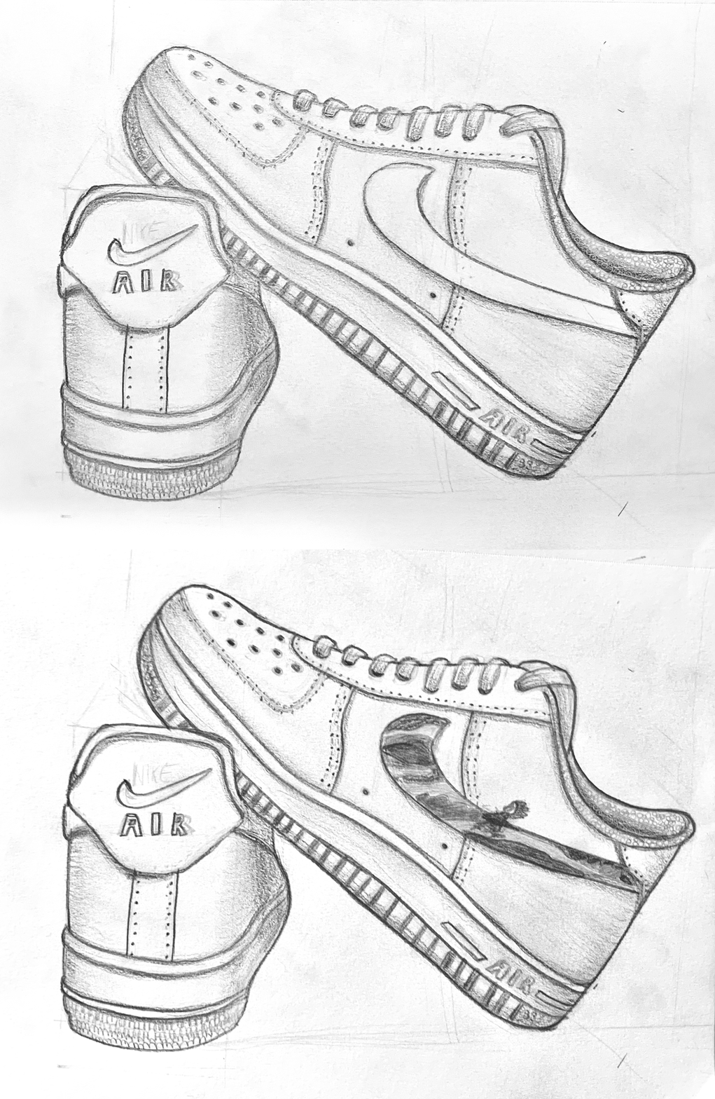
I observed the plain sneaker in order to analyze how much space I wanted to occupy and how much to leave in blank.
2
Placement
I decided to use the Swoosh. It’s a small area has a lot of potential without compromising the cleanliness.
The Scene
Since the beginning I pictured on my mind the scene I wanted to include but I needed to be sure that it would look good while sticking to the objectives.

The main character (Ponyo) runs through the waves during an intense storm
Color Palette
Trying to save as much time as possible, I obtained the exact shades using a color picker and a screenshot of the scene. Blue and purple are the main colors.
Printing makes the colors less saturated and since the colors were already very similar on screen, I decided to adjust some settings, (lighting and hue) Lastly, I removed the colors that didn’t match with the majority.
Step 3
Ideation
Sketching
In order to compare the way my ideas looked, I digitalized them very quickly using the selected colors and a picture of the shoe. I wanted to try out other scenes I had in mind to experiment other possibilities and not only explore my first idea.

Step 4
Testing
Interviews
The project was due the next day in the morning, time was running! I was super sleepy at this point and couldn’t make up my mind. I decided to do a little survey before preparing the final version to explore other’s opinions and preferences.
I texted five friends that wear sneakers everyday. None of them was enrolled in an artistic degree. I wanted them to critique the overall picture instead of the details and technique like my creative friends would.
Their favorite designs were:


Changes
I decided to make two modifications based on the results:
After two friends pointed out that the position looked weird, I realized it was too upfront. I adjusted the placement of Ponyo so that it looks like she’s running in big steps trying to get to the start of the Swoosh. Just like in the movie, she was running towards Sosuke’s car.
I thought the double Swoosh looked super cool and edgy but the survey proved me wrong. I removed the second one. And I have to admit, it does look better.
I had two reasons to stick with my first idea, my friends liked it more and it has the characteristics to achieve the goal: most of the shoe is still white so it goes well with every outfit and it is discrete, not everyone will realize it’s Ponyo.
Step 5
Final Design
Second Testing
I tested my design with friends and new faces, and the shoe got a thumbs up from everyone! But, my professor pointed out that the poster needed a size tweak to align with Nike standards.

Takeaways
I’m really happy with this design. Time was limited and I skipped a few steps but the objectives were achieved. Upon till this day some of the friends I interviewed ask about it, the biggest compliment for me is that they remember!
If I had had more time I’d have loved to interviewed more people from different age groups and occupations. I think that my although the classmates I interviewed and I are interested in different topics, our taste in sneakers is very similar.
I would have done printing tests as well, to obtain the right saturation and not only trust CMYK mode. My projects are all digital now, the few times I printed during my freshman year, I had awful experiences so printing this design would’ve have been an stressful yet rewarding challenge for me.