
Overview
Bucli
Bucli is a digital tool that turns the process of searching and contacting suppliers in Mexico into an easy and stress-free task
Project
UX/UI Design
Start Date
July 2022
Duration
13 months
Team
+SWE
Client
Bucli
UX Case Study
Bucli Platform
Problem Statement
Bucli is an online directory created to connect clients and suppliers according to their specific needs. The main features are exposure across the platform, personalised recommendations and a wide search engine with customizable filters.
How can we create an innovative platform that includes all the required elements for it to achieve the objective, meanwhile looking simple and having an effortless and quick interface/user flow?
Solution
The main objective of Bucli is to improve the life expectancy of mexican businesses (no matter the size) by having a greater exposure in the digital market. The key to achieve this was to design a platform that creates equality for all businesses and that unconsciously guides the user into having a better and richer introduction/presentation that sets the difference for them to be contacted/hired
Final Design & Key Elements

Smart Recommendations
To ensure uniform information, companies are encouraged to complete a full profile that includes key details identified in our research as crucial for client decision-making.
Make or Accept a request
A a quick and efficient way for users to express their needs and for companies to facilitate sales opportunities and to provide insights into user needs


Standarized Profile
To ensure uniform information, companies are encouraged to complete a full profile that includes key details identified in our research as crucial for client decision-making.
Step 1
Research
Market Research
I began my research by observing the information that is posted online, including articles, blogs, videos and social media posts. The objective was discover the context and to understand the users, their behaviours, preferences and needs.
Key Questions
- Who needs and will use the product?
Show Answer
- What are the existent problems?
Show Answer
- Why haven’t they been solved?
Show Answer
Competition Analysis
In order to make the website intuitive for the users, it is important to understand and compare similar platforms. I used a comparative table to obtain the general characteristics and best features that are commonly used.

Key Questions
- What are users used to?
Show Answer
- Which design features work?
Show Answer
- Which design features do not work?
Show Answer
- What are the key considerations?
Show Answer
User (Experience) Interviews
After analyzing the information, I compiled a list of questions with the aim of understanding previous experiences in contacting suppliers, gathering specific suggestions, testing hypotheses, and exploring the various methods available for supplier discovery.
User Profile
Mexican entrepreneurs with multiple small to medium-sized businesses spanning various sectors.
Hypothesis
-
It is preferable to have a transparent price estimate visible
-
Many users choose companies based on their ethical values
-
It is crucial to know the immediate availability of products
-
Manual comparison proves to be beneficial
Key Findings
Based on the key design elements identified in the UX research, it is evident that supplier differentiation is paramount. Suppliers must effectively communicate what distinguishes them from others, emphasizing visual representation, language, and formality. Location emerged as a crucial factor in the decision-making process, influencing which suppliers businesses choose to engage with.

Insights
Users express a need for suppliers to transparently showcase what makes them unique, aligning with the desire for professionalism and effective communication.
The observations on reputation, price, quality, and service underscore users' priorities in assessing potential suppliers.

Step 2
Ideation
Information Architecture
In crafting the information architecture diagram, I carefully curated essential sections and data in response to key findings and user insights. By incorporating critical factors like reputation and quality assessment, ensures a streamlined and effective platform for engaging with suppliers.


User Flow
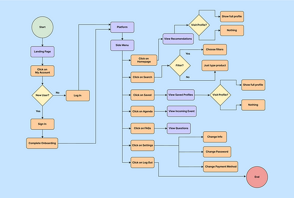
I streamlined the experience by incorporating the most crucial tasks, ensuring an intuitive and efficient journey. By prioritizing key actions and minimizing steps, the user flow is designed to be seamless and user-friendly.
Sketches
My sketches served as a flexible and creative starting point for the design, allowing for the exploration and iteration of various design concepts. Through this informal approach, I sought to capture and refine the most promising ideas for further development.


First Digital Iterations
I like to design maaany digital iterations, I embarked on a visual exploration of potential solutions, experimenting with colors and UI design. This work-in-progress phase involved continuous adjustments based on user feedback, addressing specific user needs and incorporating valuable suggestions from developers.

Step 3
Design
Solution #1: A temporary solution

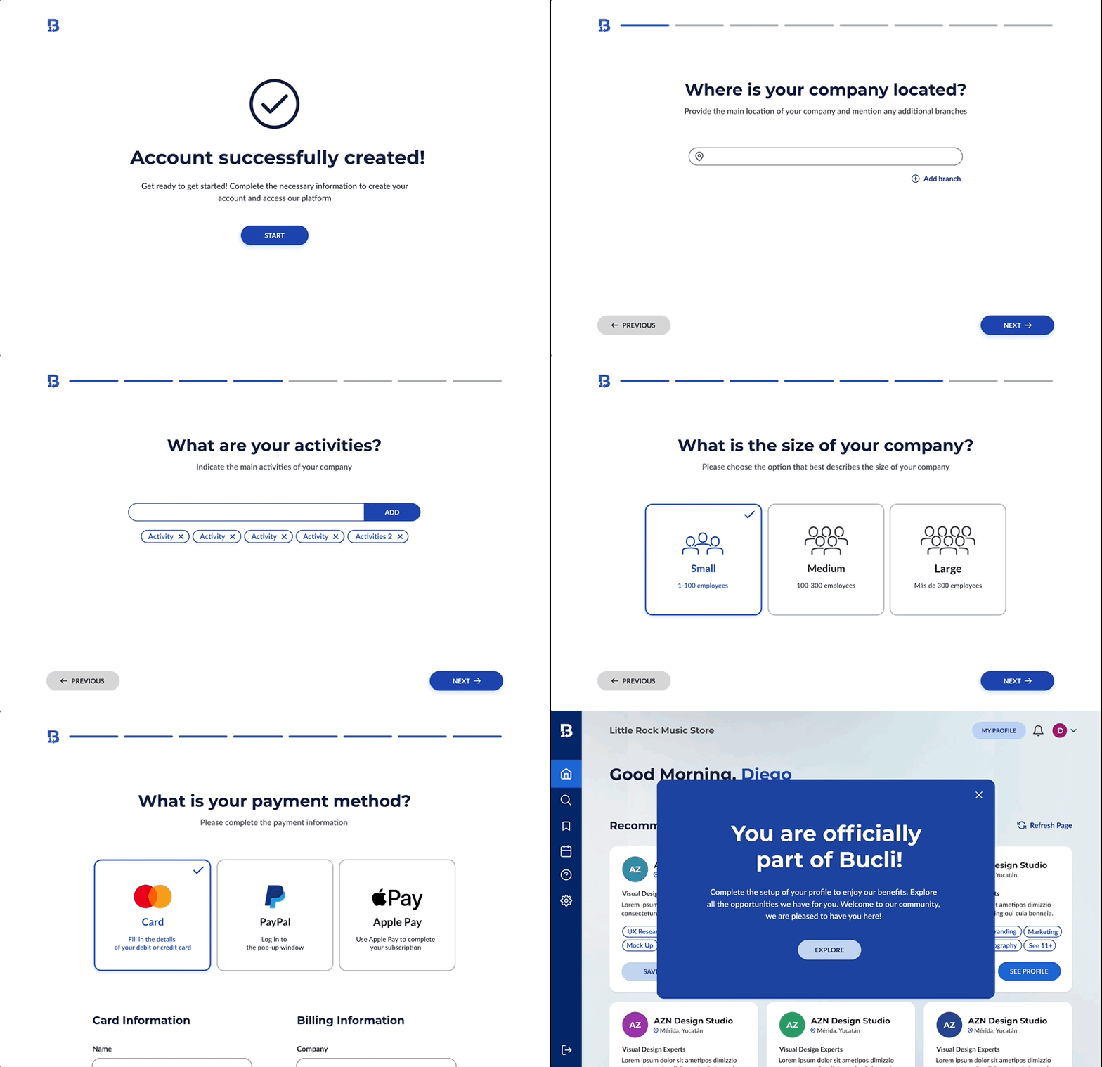
Collaborating closely with the development team, we recognized the challenge posed by the vast array of products and services that exist. Rather than creating an exhaustive list pre-launch, we leverage user onboarding to gather real-time information on company size, industry, activities, and products/services. This approach ensures a more accurate and dynamic database from the start, enhancing the precision and relevance of our platform.
Solution #2: Opting for a uniform visual representation

Omitting profile pictures for the minimized profiles of recommended companies on our website is a deliberate choice to promote equality. Many companies may lack the resources for professional logos, and our decision ensures an impartial opportunity fto be contacted or hired. This design choice aligns with our ethos of providing an unbiased platform that values each company's offerings based on merit rather than branding aesthetics.
Solution #3: Research-based standarized full profile


Companies are prompted to complete a standardized full profile, incorporating key details identified in our research for client decision-making. This approach not only levels the playing field, preventing any company from displaying less relevant information, but it also simplifies the decision process for clients by providing a consistent set of essential criteria for comparison.
Solution #4: Make / Accept a Request

The decision to create a brief and simple "Make a Request" form stems from the goal of streamlining the search process for individuals seeking specific products or services within a short timeframe. This request form can be later enhanced with price and additional specifications. Simultaneously, companies can accept or decline requests and obtain insights into user needs to enhance their services.
Solution #5: Try out search and filter engine

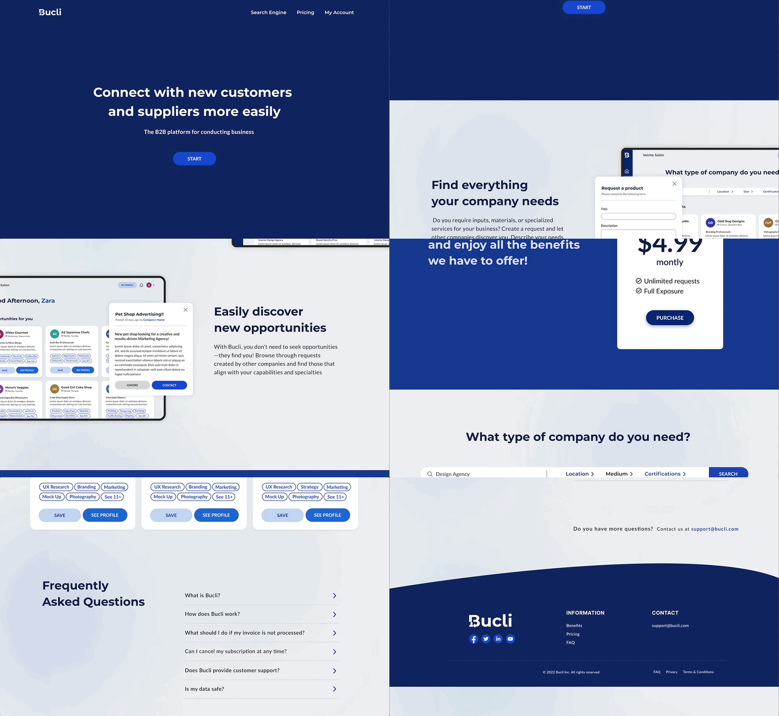
To allow users to experience the platform before committing to payment, we offer a trial of the search and filter engine section in the lading page. This enables users to explore the platform's capabilities firsthand. Account creation is necessary for accessing contact information.
Step 4
Final Design
Woking Process
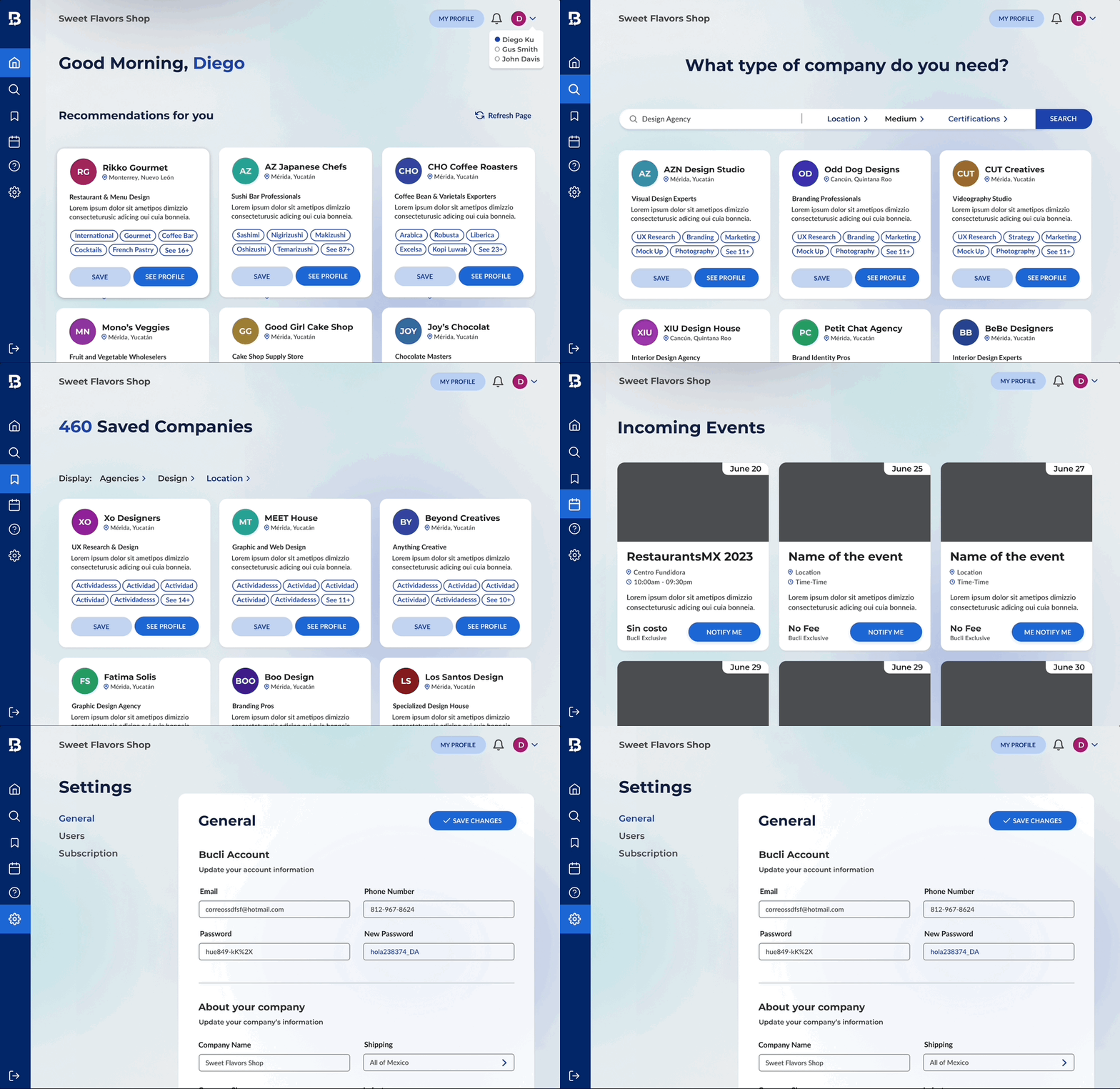
The final design presented is a work in progress, serving as a foundational framework that can be further enhanced based on user feedback and interactions once the platform is launched. It is designed with flexibility to accommodate user preferences, ensuring that the ultimate user experience is shaped collaboratively with those who engage with the platform.
Landing Page

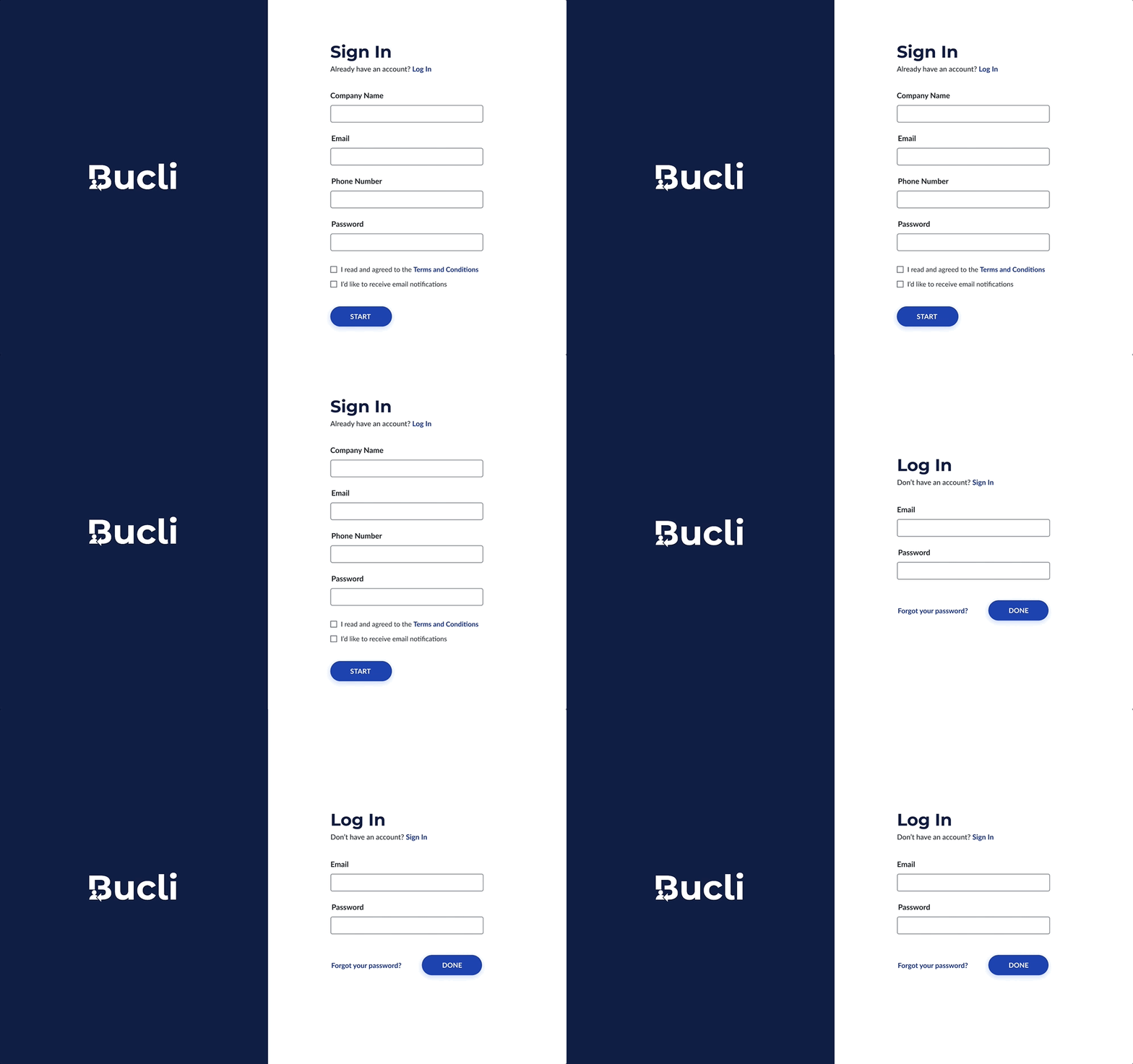
Log In / Sign Up
Onboarding
Platform
Next Steps
As the platform becomes available, user insights will play a pivotal role in refining and optimizing the design to meet the evolving needs and expectations of our community.
Takeaways
Reflecting on this project, my key takeaways revolved around the significance of color contrast in enhancing UI design and the implementation of effective UX techniques to streamline processes for the development team. Additionally, the importance of aligning design choices with client needs and preferences emerged as a guiding principle.
Looking forward, I aim to further refine my design approach through formal usability tests, ensuring that user experience remains at the forefront of future projects.